Project Summary
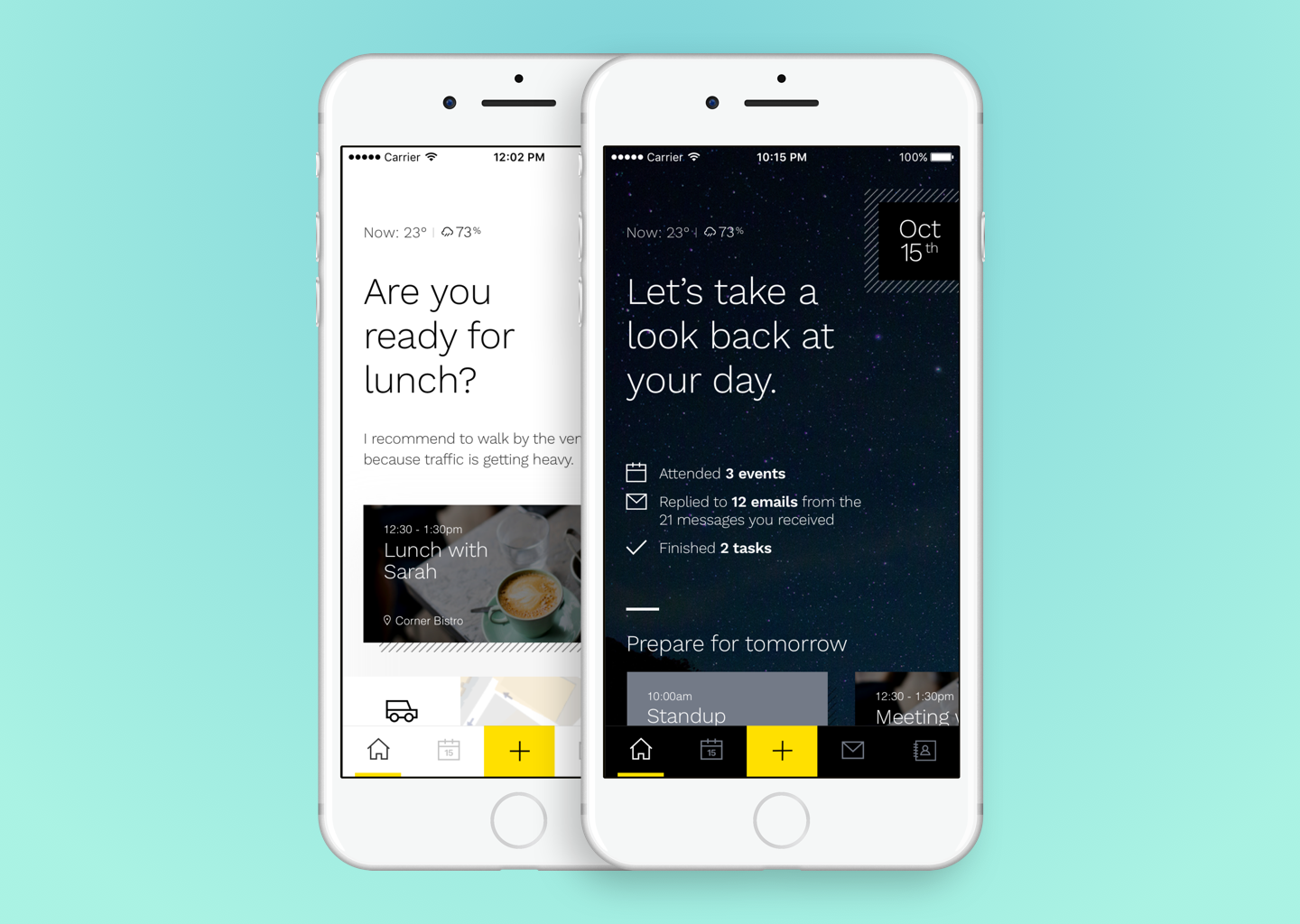
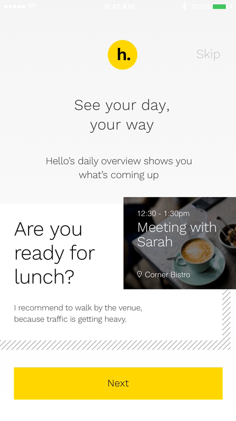
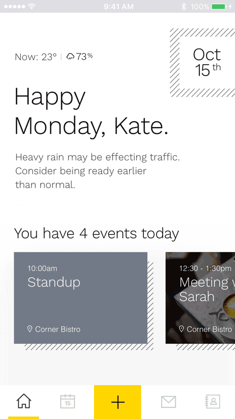
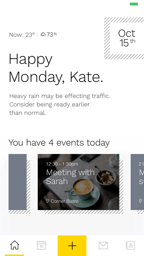
What’s the future of email? Chat apps are now the primary tool for everyday communication with friends and colleagues and email has shifted its purpose. People use it as a todo-list, or part of a security workflow that people need to validate their accounts (think: logging onto Slack). Email seem to have changed into something that validates our identity, or gives you purposeful information: meeting agendas, upcoming lunches, or a bill waiting to be paid.
The team at Huge designed proposal of an experience that helps people do more by helping people think less.
My Role
As UX designer, I was involved in user research through one-on-one interviews, competitive analysis, and designing user flows and wireframes, and user testing. I worked with an art director and visual designer who set the brand guidelines, which I applied onto the rest of the screens for the app. I designed the interactions using Framer.
Process
The team engaged the client through a workshop to understand their brand and the goals of their team internally. User interviews and competitive analysis was done prior to the design phase. We interviewed a small group of professionals and narrowed down common use cases for email:
- Communication
- Planning and Organization
- Relationships and Networks
- Identity
Email has gone beyond being a ‘communication tool’. Looking at it from a different perspective, people have been using it to form new habits or accomplish personal and professional goals. Although traditional email as we knew it was changing, it was not necessarily dead. APIs have made the email experience faster and convenient for people.
The team proposed an experience that can push people towards accomplishing tasks rather than digging for information in their Inbox.
Design
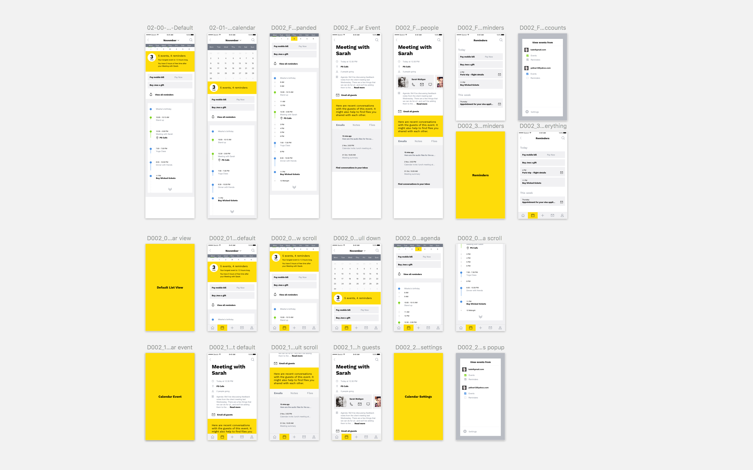
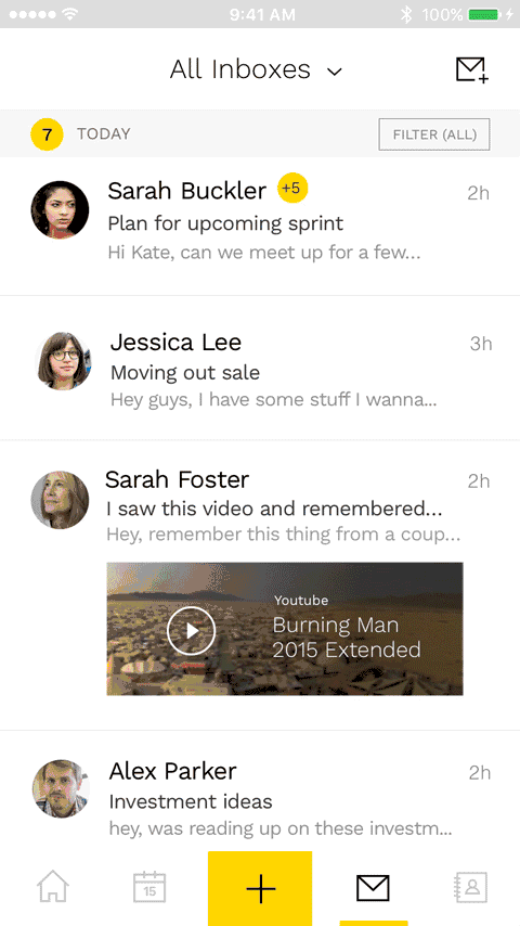
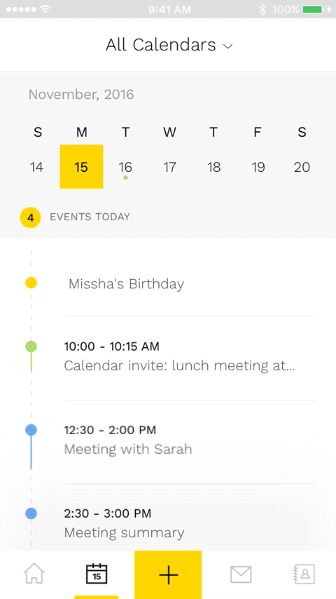
Emphasis was put on bottom navigation and gesture-based browsing. Swiping through emails makes it easier to go through important agendas quickly. The screen estate was optimized to show the most relevant information where additional info can be pulled from the top.
Evaluation
The team had user testing sessions to evaluate the proposed experience. We implemented some design and content changes following the tests to improve on the usability and clarity of the experience. Icons that were too vague were redesigned to conform to imagery that people were more familiar with.
The proposal was received well by the client. We had a month for research, design, and prototyping and I was happy with what our team was able to accomplish in a short timeframe. Building the prototype using Framer helped the team bring the experience to the client’s devices especially when we had to present the product remotely.
If I were to do the project again, I would like to accomplish a few things:
- Integrate more services into the experience to show email as part of an ecosystem.
- Demonstrate the impact of personalization and NLP when managing tasks.