Project Summary
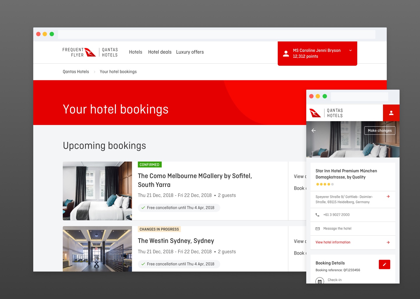
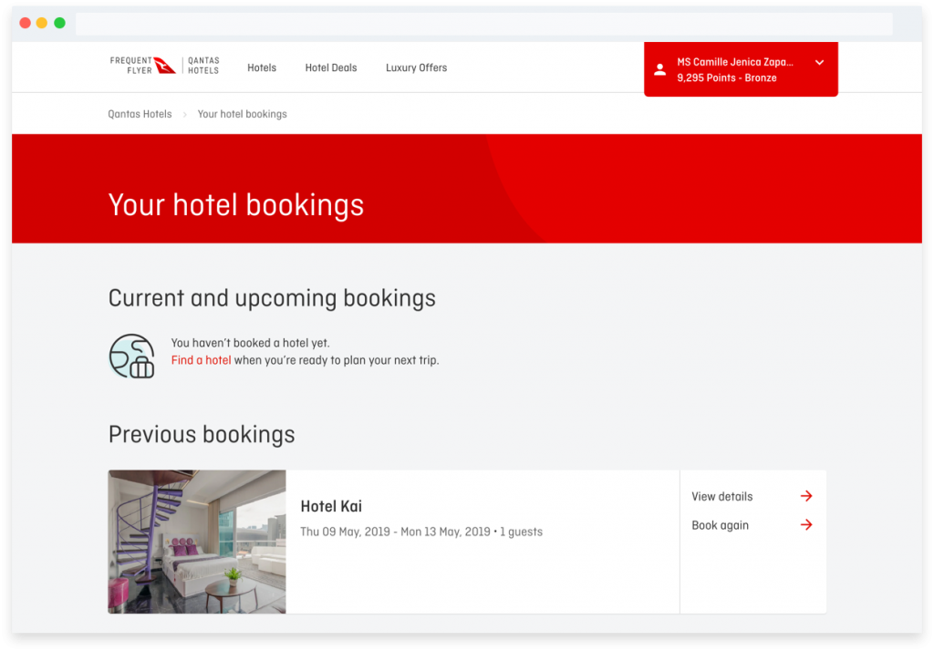
Before 2019, customers who booked a hotel through Qantas could only access the details about their booking through their email confirmation. In 2019, our team released the portal in which customers can finally view and access all their current and past bookings.
I was the product designer, and I was responsible for user research, design discovery, and the final visual/ui designs. I tested user flows through prototypes. Our primary goal was to provide customers the information they need exactly when the needed it, and to give customers a way to manage bookings through self-help.
The Problem
How might we give our customers more control over their bookings?
The company was aware that it was falling a little behind our customers’ expectations. While all our competitors already had tools that allow their customers to manage their lodgings online, Qantas customers could only view details about the hotel they’ve booked by combing through their inbox and looking for their confirmation email.
Customers could already cancel bookings through a special link in their confirmation email. In this project, our goal was to extend that functionality and give our customers the ability to change or manage their bookings. The benefits to the company was two-fold: customers can make changes quickly (which would make them happy), and our call center won’t be bogged down by small tasks. If customers can resolve some booking issues through self-help, our customer service team can focus on resolving bigger tickets that require more of their time and knowledge.
Discovery
The team had to first decide which key functionalities, apart from viewing bookings, that we have to build for our customers. We were able to get data from the Customer Service team, who managed the calls the company receives from customers. Cancellations was the top reason for customer support calls (and this feature was already available, we only needed to integrate it into the customer’s account section). This is followed by changing booking details (such as guest name, email, and phone number). Other sources of customer information included surveys and customer call recordings. I had access to the types of questions customers typically asked when they call customer support, and saw an opportunity to address these topics through the customer’s account portal.
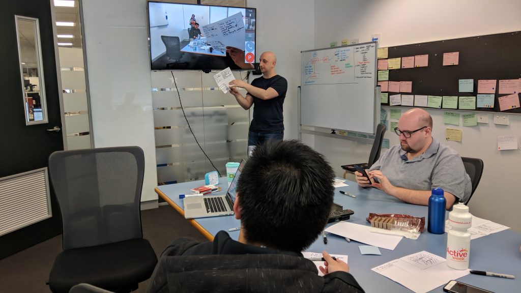
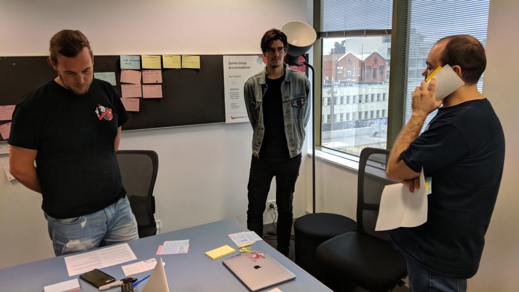
I facilitated a number of workshops to generate ideas from the team and other stakeholders. We involved the Customer Support team, which was based overseas, since they deal with our customers directly. Discovery and design workshops uncovered needs not just of our customers but also of our customer service representatives.
Some workshops I facilitated:
- listening to a few customer support calls with the product team to build empathy and share ideas to solve customer pain points
- prioritization with the customer service team to understand which features they think our customers would need the most
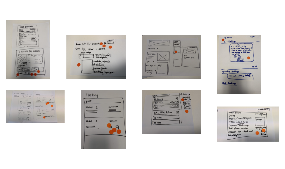
- sketch sessions with different teams and stakeholders to involve everyone in the early design process, as well as listen to their insights
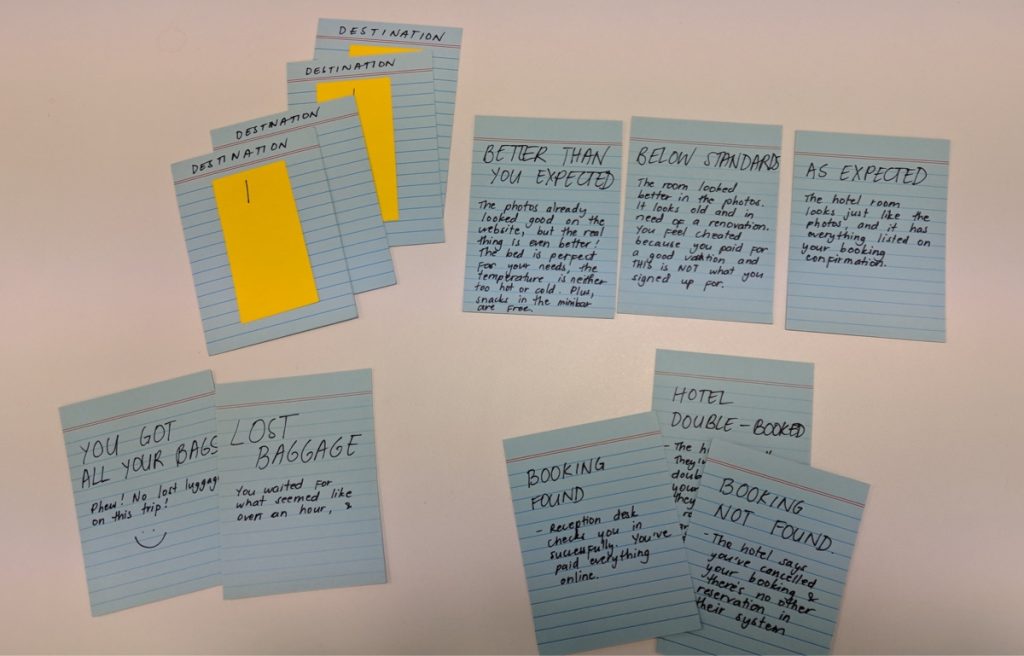
- a gamification of the customer journey
Design
The MVP for the customer’s account section included:
- the new navigation for customers to access their account
- the ability for a customer to view their bookings
- the ability for a customer to cancel a booking
I went through a process of adding and subtracting elements when refining the designs for each screen. I created prototypes via Sketch, Axure, and Framer (depending on what I want to test) to demonstrate interactions and test various flows in different platforms. It was important that the site worked excellently on mobile, since travelers would use it as their primary device to manage bookings on the go.
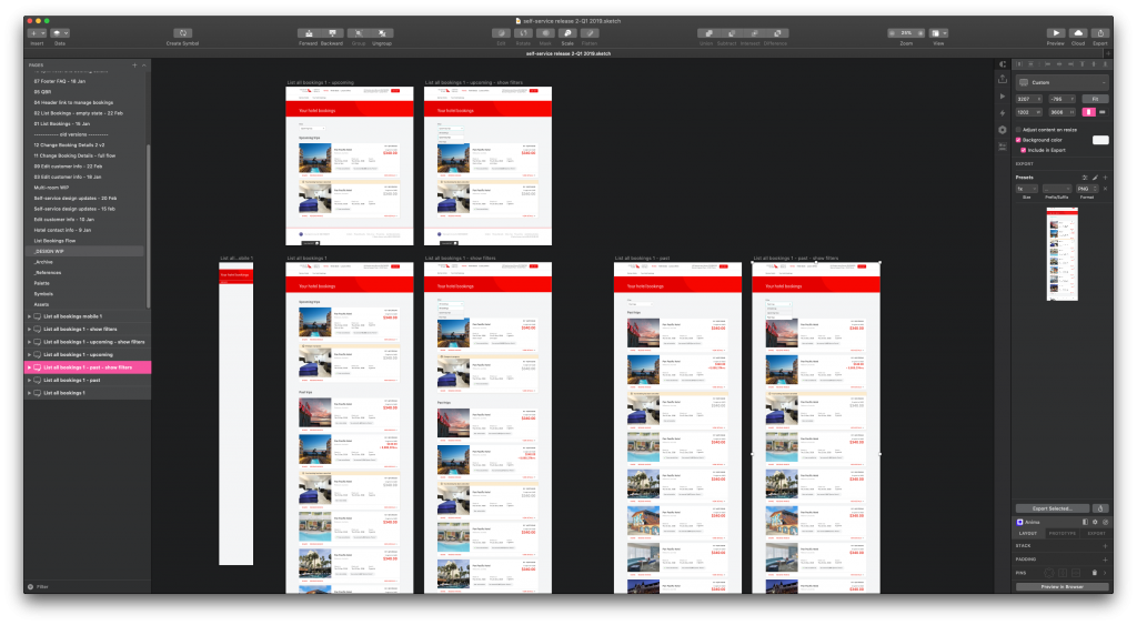
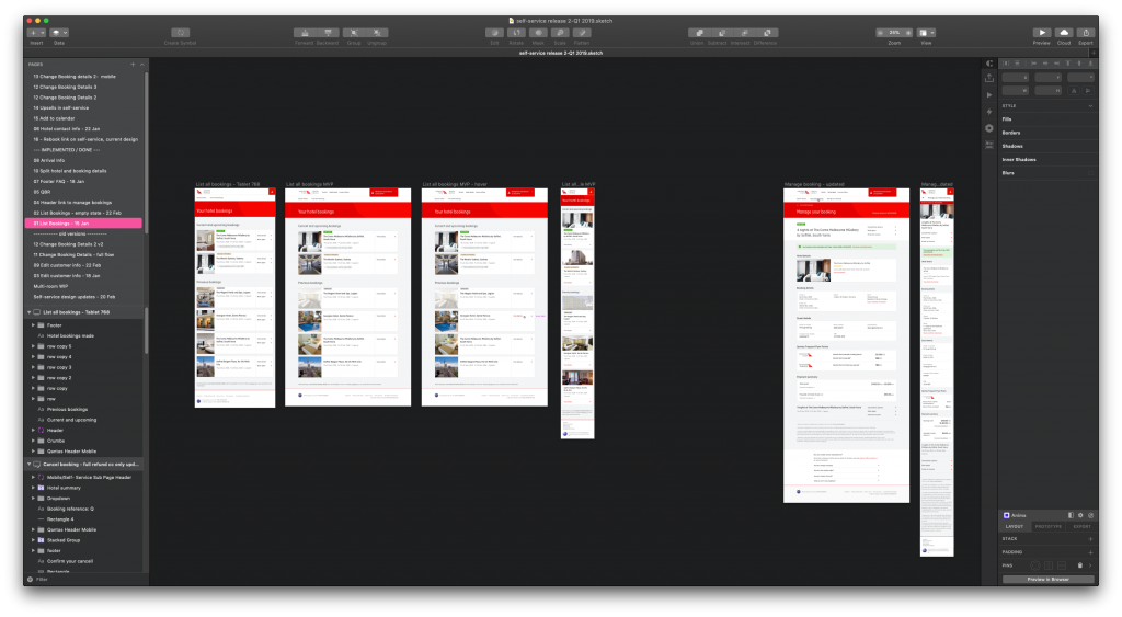
I also went through a few design rounds to make elements scalable. We had a number of features we were planning to build next and I had to think ahead to accommodate these in the future. A menu with 2 links on launch may have 4 in the next year or so.
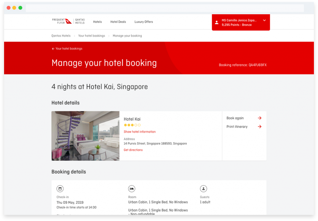
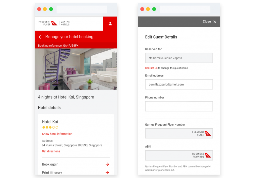
The final designs can also be viewed when a Qantas customer logs in here to manage their bookings.
Launch
After launching the MVP, we put up a poll on the Account section to ask customers what they would want to see on this page. This gave the team direction in terms of what to build next.
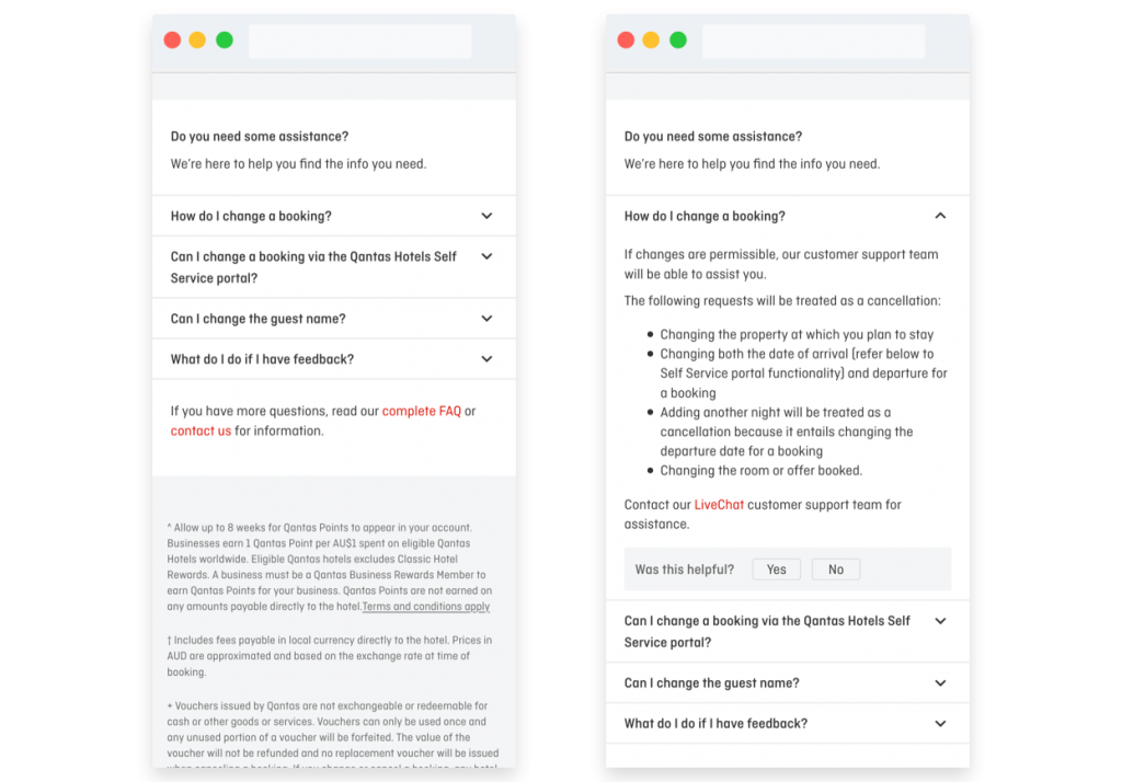
One of the top requests by customers was the ability to change the guest name themselves. Unfortunately, this was just one of the few things they had to resolve through a call because of identity verification steps. There were other top requests such as rebooking (instead of cancellation). Since we would need more time to implement features that would resolve these hot pain points, we thought about adding an FAQ at the bottom of the page with the top questions/requests.
To measure the effectiveness of this feature (and the relevance of each question), a small yes/no question appears at the bottom of each FAQ question.
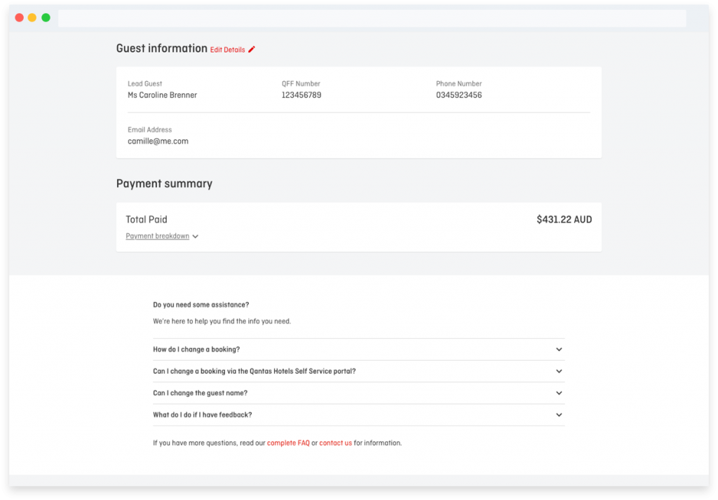
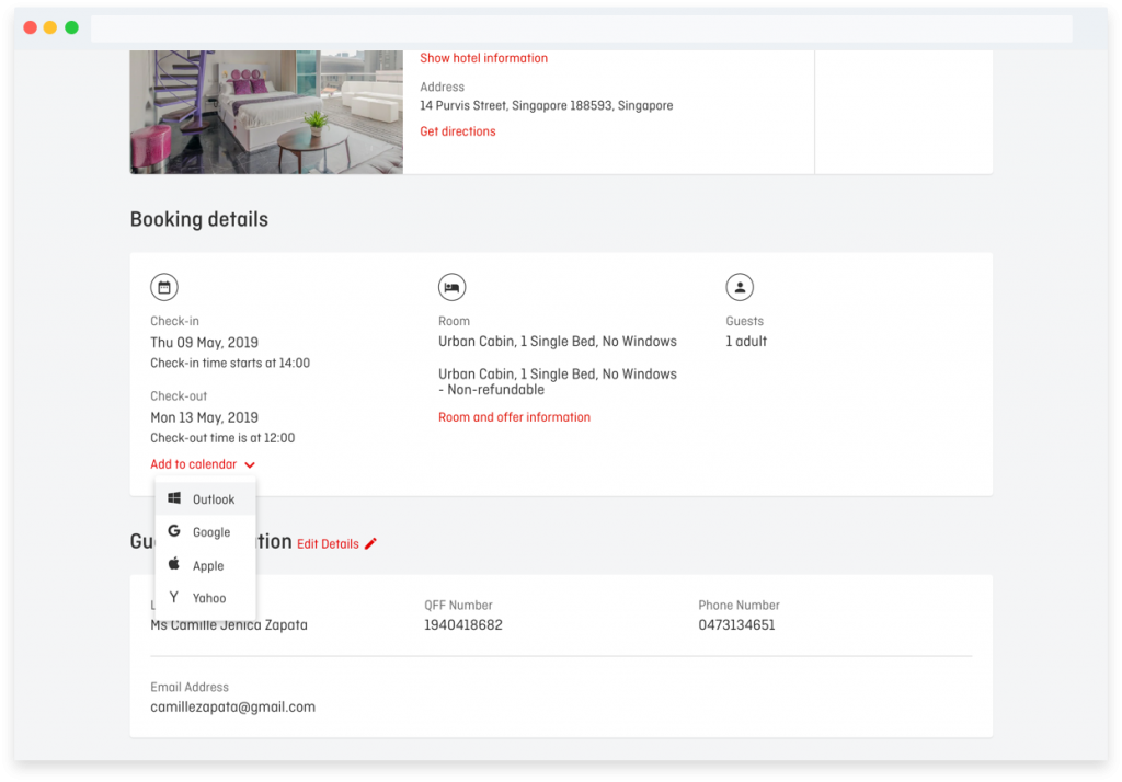
Other small and quick-wins for the team were useful features that were easy to add. While we were working on features that would take time to be delivered, we wanted to provide a little convenience for customers where we can.
Learnings
The workshops and customer call recordings highlighted very early on just how much we could “empower” our customers. With a product that was primarily online, there were limitations on what we can do for our customers. A traveler stuck in the middle of a town without internet, or lost in a city whose language they cannot read or understand, are already common pain points that our product cannot address. We had to move away from some of these in order to focus on problems we had the ability to solve.
We were tracking engagement and regularly had polls on the site to provide the team with a constant feedback loop with our customers. I left Qantas shortly after our launch and was unable to keep track of the usefulness of some of the features.
We needed more time to measure the impact of the product on the number of customer calls our customer service team was receiving, although our customers had quickly shifted to managing and checking their booking through their account once the feature went live. There was a consistent upward trend of user adoption, so we knew that managing their bookings was a much-awaited feature.
One of the challenges for me as a designer was this constant mental debate about consistency in design patterns. Should I stick to a pattern used by a different team on a different product, since it is ‘familiar’ to our customers, or should I introduce a better pattern that fits for the context I am designing for? (I went back and forth through different designs because of this issue!)
I tried to find a balance in between and at the end of the day usability won. If an interface or design pattern had some similarities (for example, same color for links), if it is easy to use and understand then the customer won’t have any trouble adapting to some slight differences between the products under the Qantas umbrella.
I also discovered just how much I enjoyed facilitating workshops with my team, even as far as doing an ideation workshop with a remote team where we were able to share designs with each other. Gamification of the customer’s journey was so enjoyable, we were planning to apply it to other projects. It wasn’t often that I had so much time for design discovery, and I learned so much about collaboration by facilitating different types of workshops.
This project has affected how I work, not just with pixels but also with people, in the best way possible.
