Project Summary
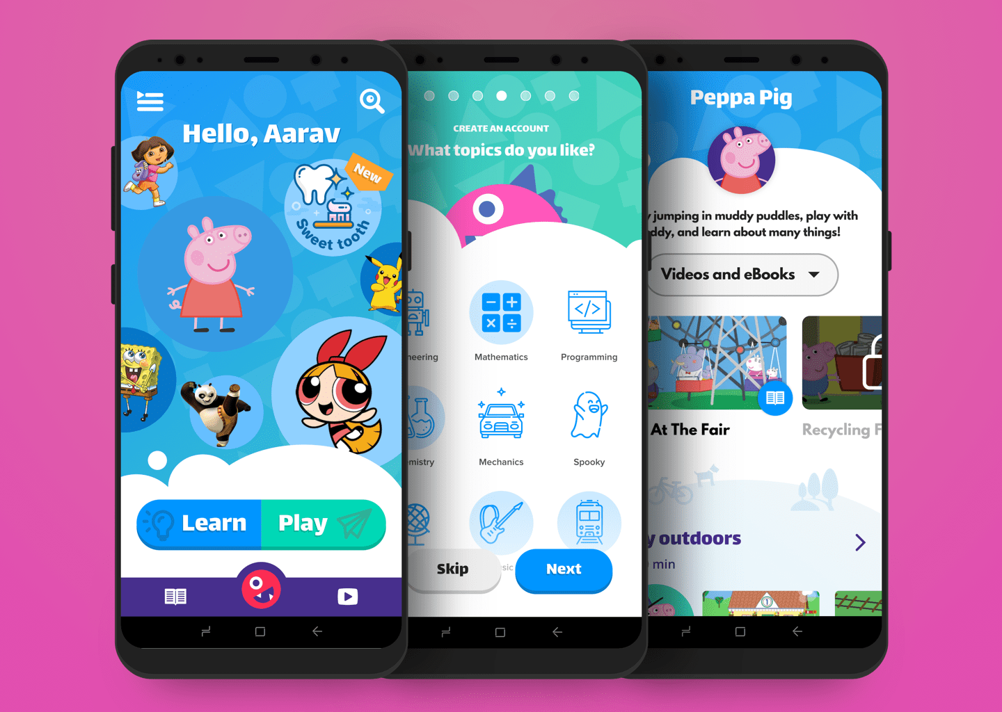
The team worked on a pitch for a media consumption experience that focused on learning for kids.
My Role
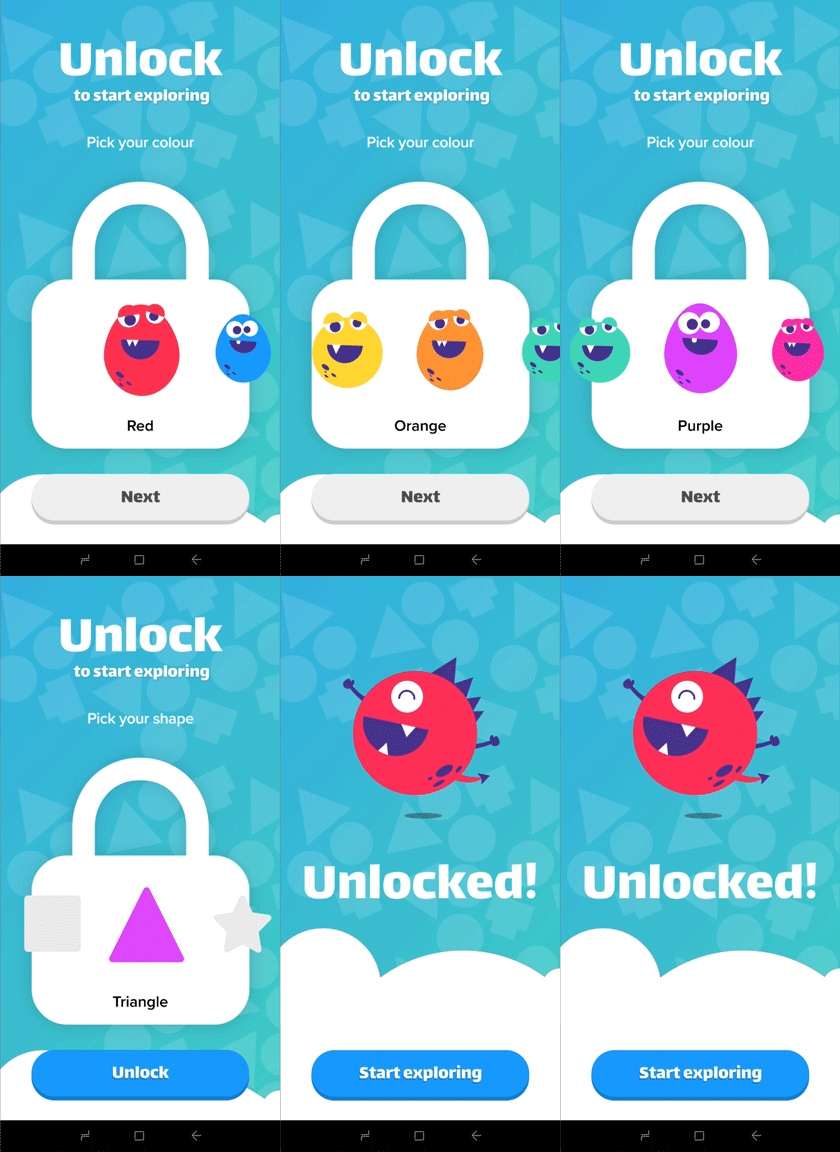
I was part of a team of two other UX designers and an art director. The user flows were divided among the team and I designed the onboarding and search experiences. I did visual design that followed some design guidelines set by the art director.
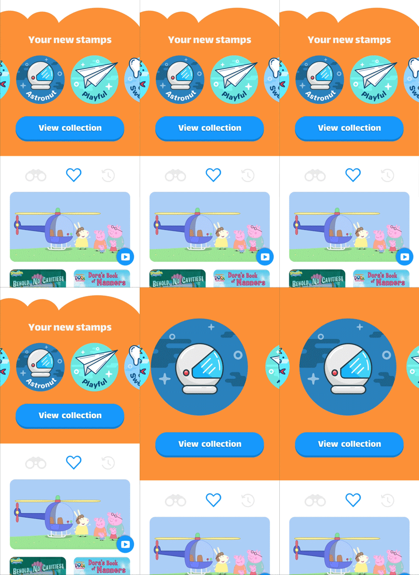
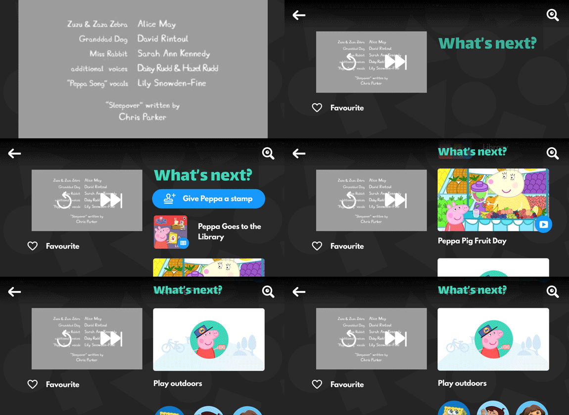
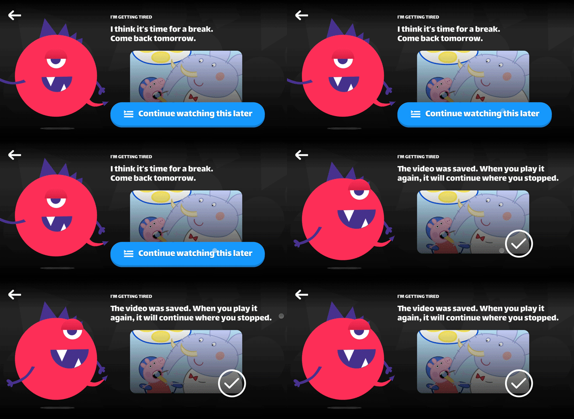
I used Principle to prototype interactions for some of the screens.
Process
One of the members of the team conducted user interviews (children aged 3-10). We also conducted a survey among parents from different parts of Asia, UK, and US to understand what their concerns are regarding media content apps (TV shows, e-books) and their kids’ interactions with these products.
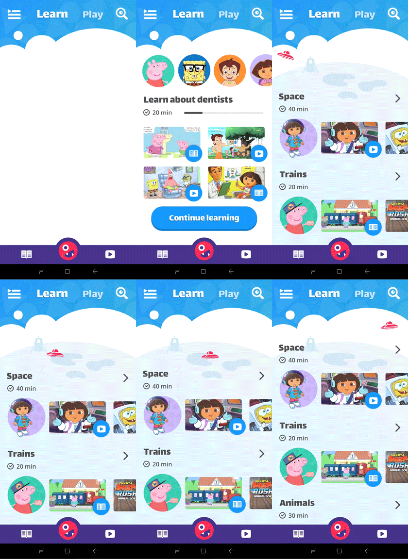
Following our findings, we designed an experience where media consumption for kids doesn’t have to be boxed within their favorite characters. We explored showing videos and books under learning buckets such as maths, music, outdoors, geography, or careers like doctors and dentistry. We also integrated short quizzes to put emphasis on topics and terms that children may learn from.
Design
The app was designed for kids. I’ve taken a more visual approach to the experience: more space for thumbnails and images, bigger and readable text, and wide tappable areas. Children should be able to navigate through content without reading.
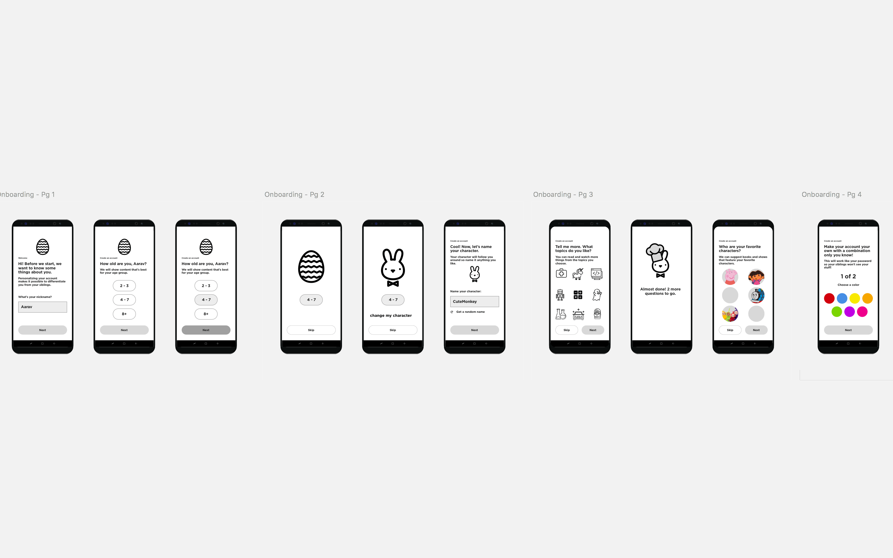
I started with wireframes and went through iterations to polish the copy and content.
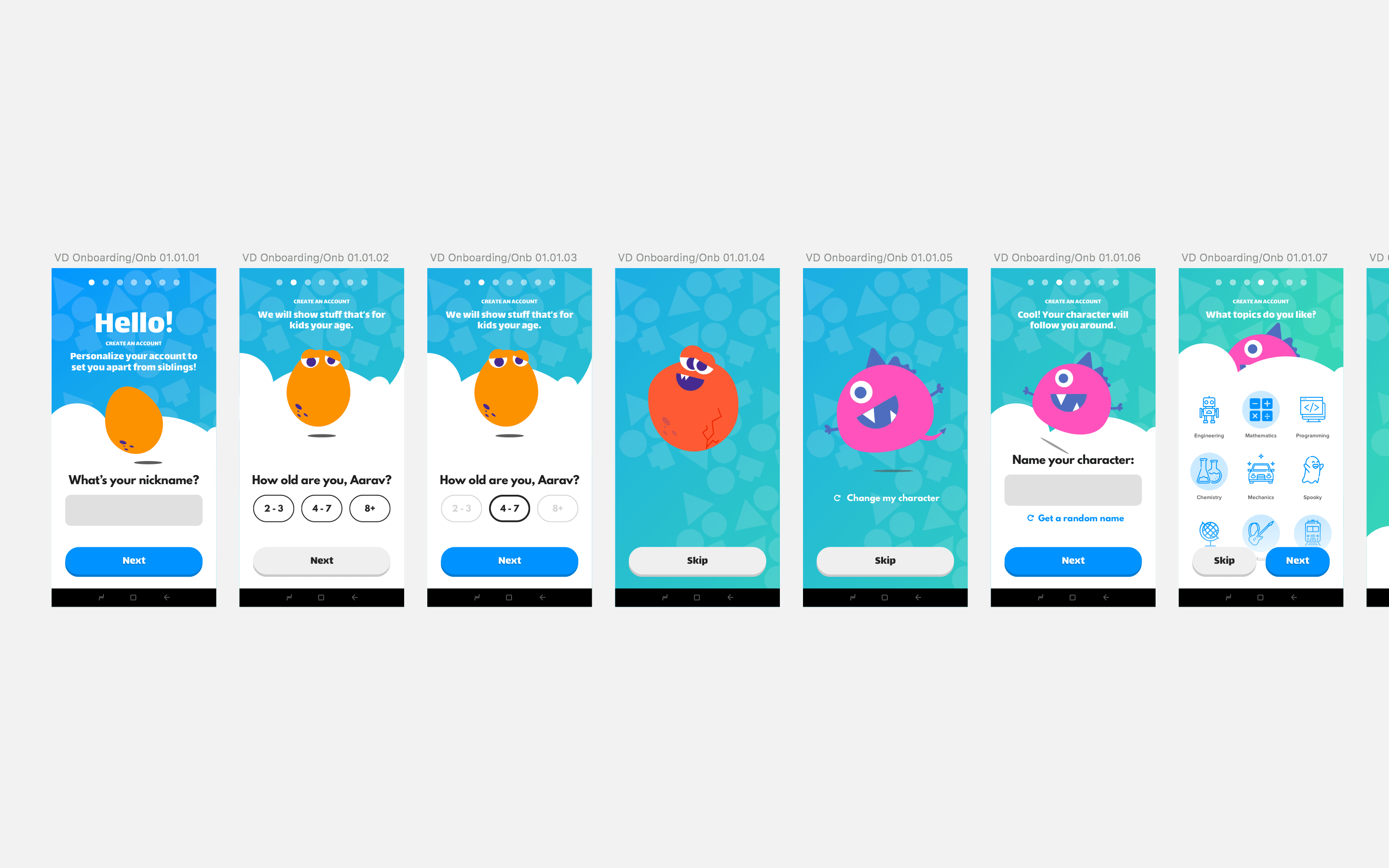
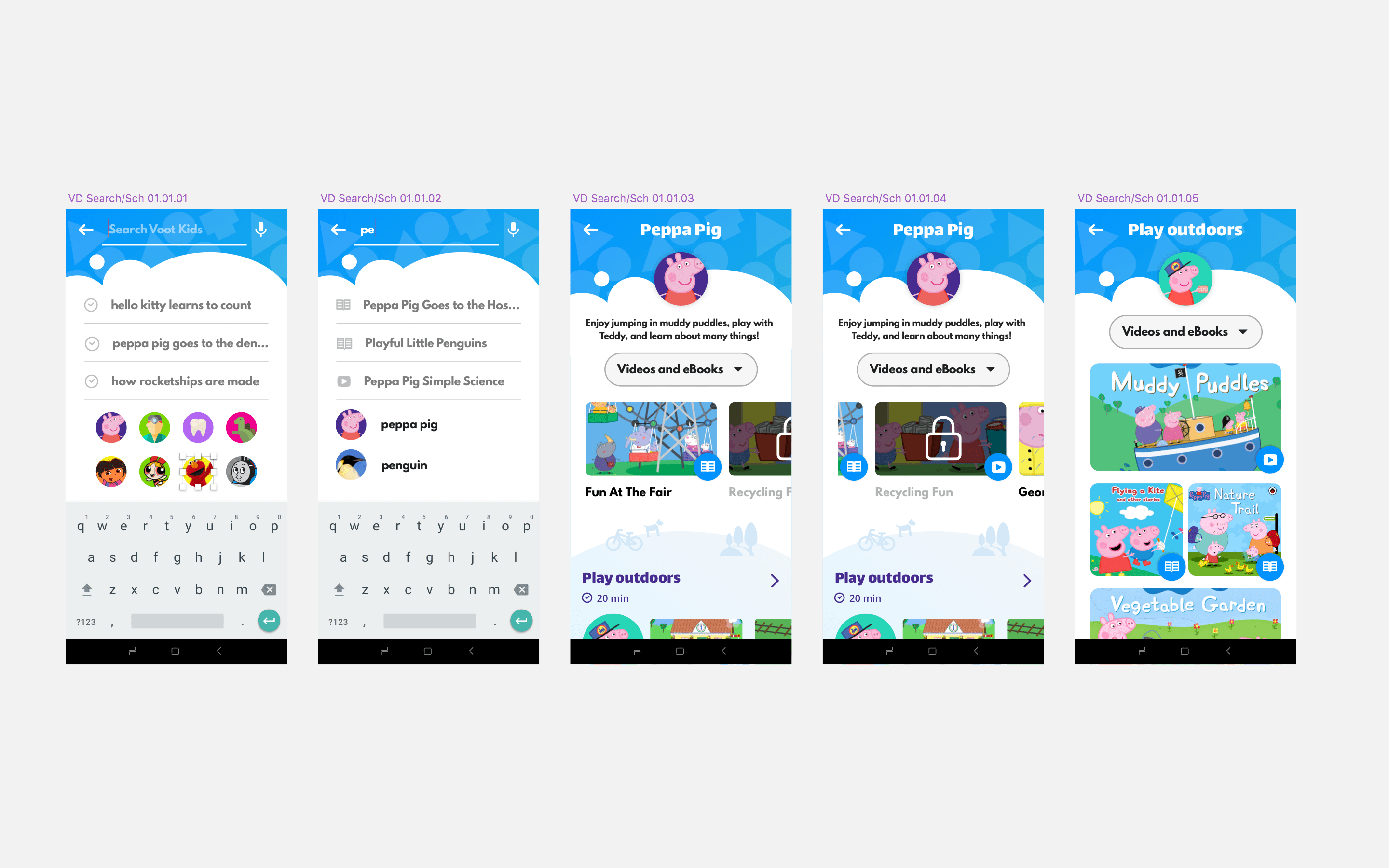
Interactions were done using Principle to demonstrate animations for some screens.
