Project Summary
A project brief from a client lead to a proposal to transform their business into a service-oriented experience instead of focusing only on consumer products.
Our team designed an omni-channel experience that could differentiate itself from other skincare brands in the industry. We wanted to give women confidence by building trust between them and a luxury beauty brand brand through a freshly integrated online and offline experience. The online content was geared towards guiding customers to understand skincare and encourage them towards booking consultations with Beauty Consultants in retail stores and counters, while building trust as they use SK-II’s beauty products.
My Role
As the product designer in the team, I assisted in various phases:
The first phase was the vision phase, in which I did some initial research work for the team members to compare how some brands have been evolving, and what new technologies are being used to connect physical and digital experiences.
The second phase was design and development, in which I was part of a UX team with 3 other designers. Our team was responsible for the user flows, initial UI proposals, and overall UX design. I proposed a collaborative workflow for the designers using the Sketch design tool, the Craft plugin, and a library synced over Box and this was used for the project. I was responsible for user flows for certain pages of the site as well as prototyping navigation patterns and interaction designs.
The last phase was future vision work, where I designed and created a chatbot prototype for an internal client event, where stakeholders and attendees were able to access rich content by talking with a Facebook chatbot on their mobile phones.
The Problem
How could we convince customers to repurchase our skincare products?
The skincare market is saturated with options and the products use very similar ingredients, address the same skin concerns of their customers, and with little differentiation from each other. How could our client transform their current customers into lifetime customers?
Strategy
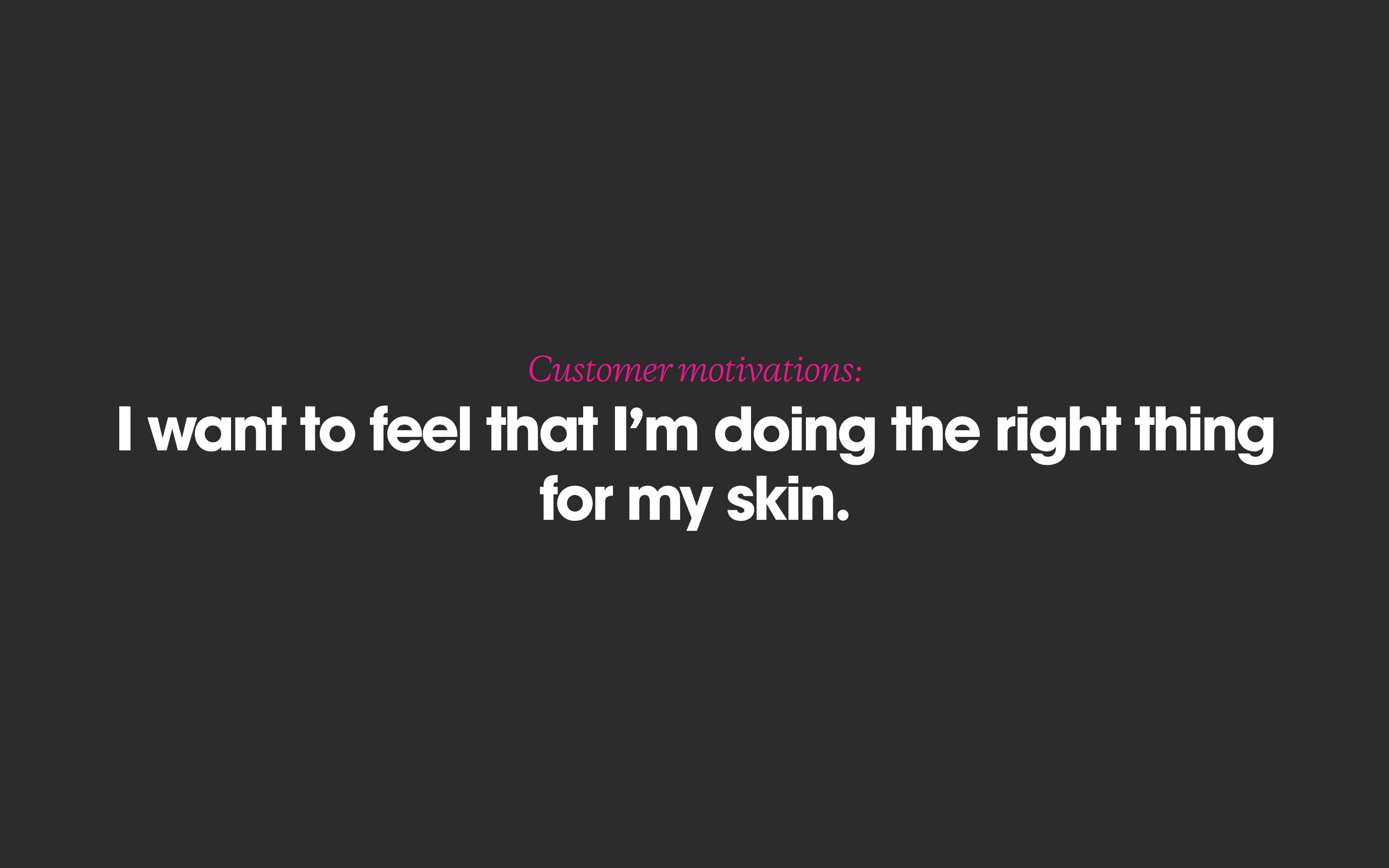
Future brand experiences are making themselves present in the life of the consumer at different times both digitally and physically, accompanying them in every step of the way. Our client’s brand experience should go beyond the products they sell and be more involved with the customers’ skincare journey. It’s very important for the brand to educate their customers on proper usage of their products so that the customers could see the results on their skin, which could lead to repurchasing. The client’s data showed that customers who repurchase have a very high probability of becoming lifetime customers which is the brand’s overall goal.
One of the channels in which our customers start their journey is the brand website or social apps (WeChat) and for this project the team focused on the web channel.
Process
Research: looking at the landscape and understanding customers
We looked at how brands are transforming their businesses and I did some research to assist the business and strategy teams. I identified trends and technologies from other brands in various industries and listed down companies that have evolved or expanded their product experiences.

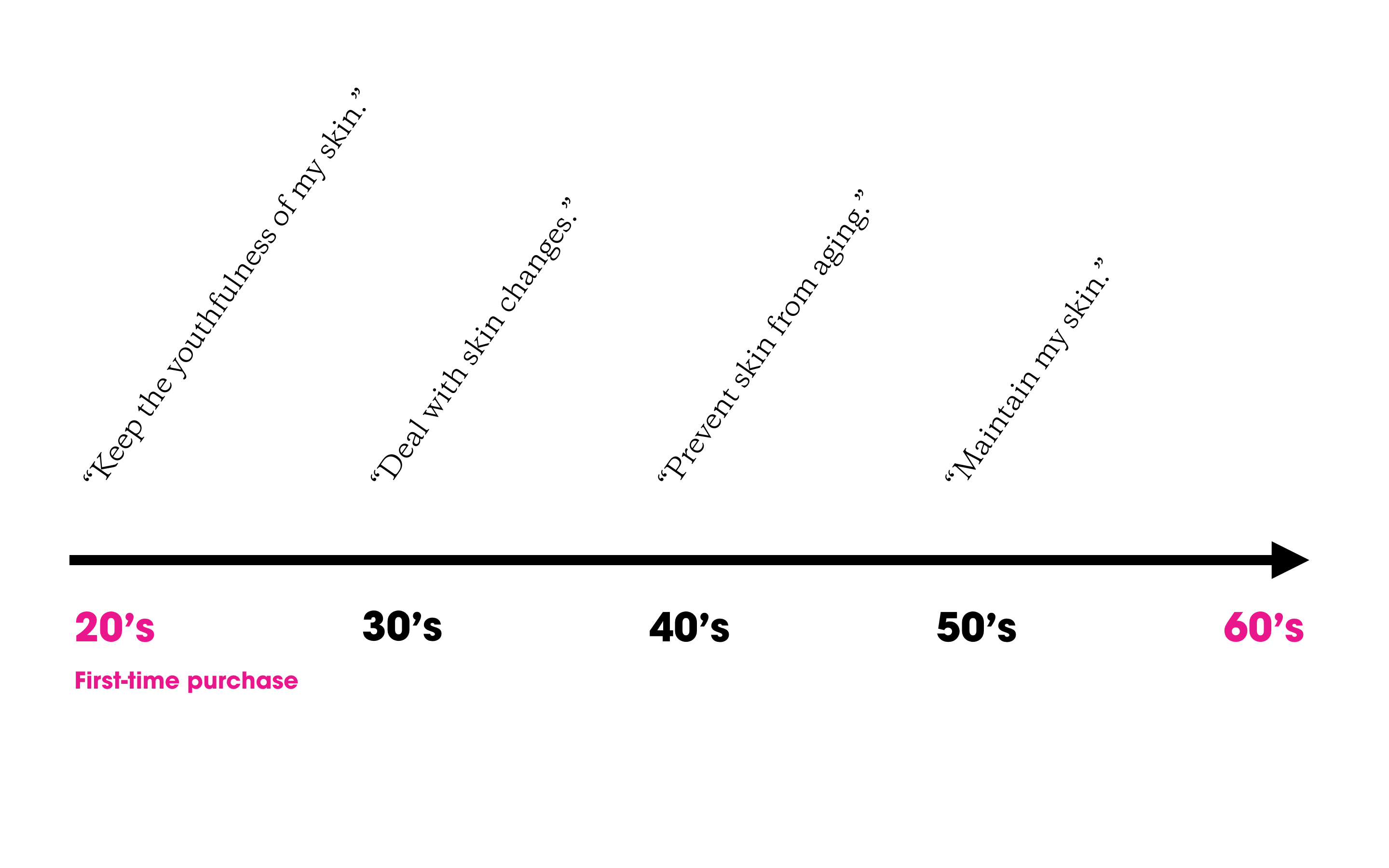
Once the design process started, I first wanted to understand our customers. I identified the types of people visiting the site based on their knowledge on skincare, modified it based on our client’s target market, and then mapped out their journeys in a diagram:
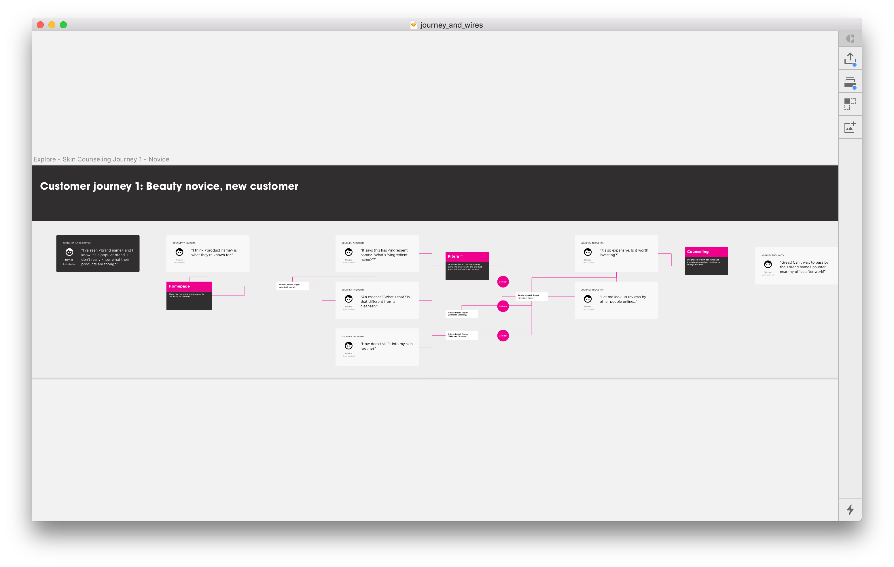
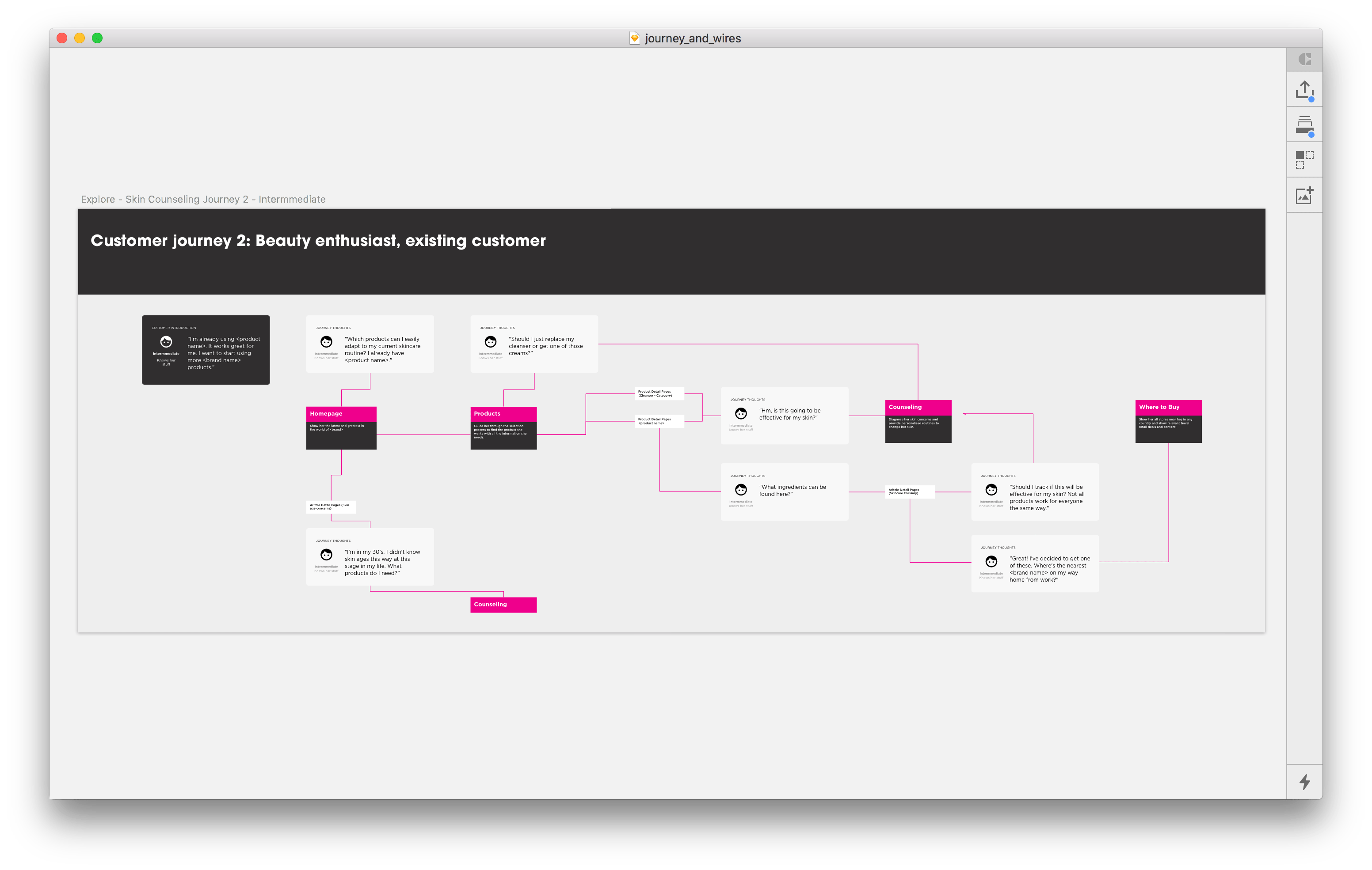
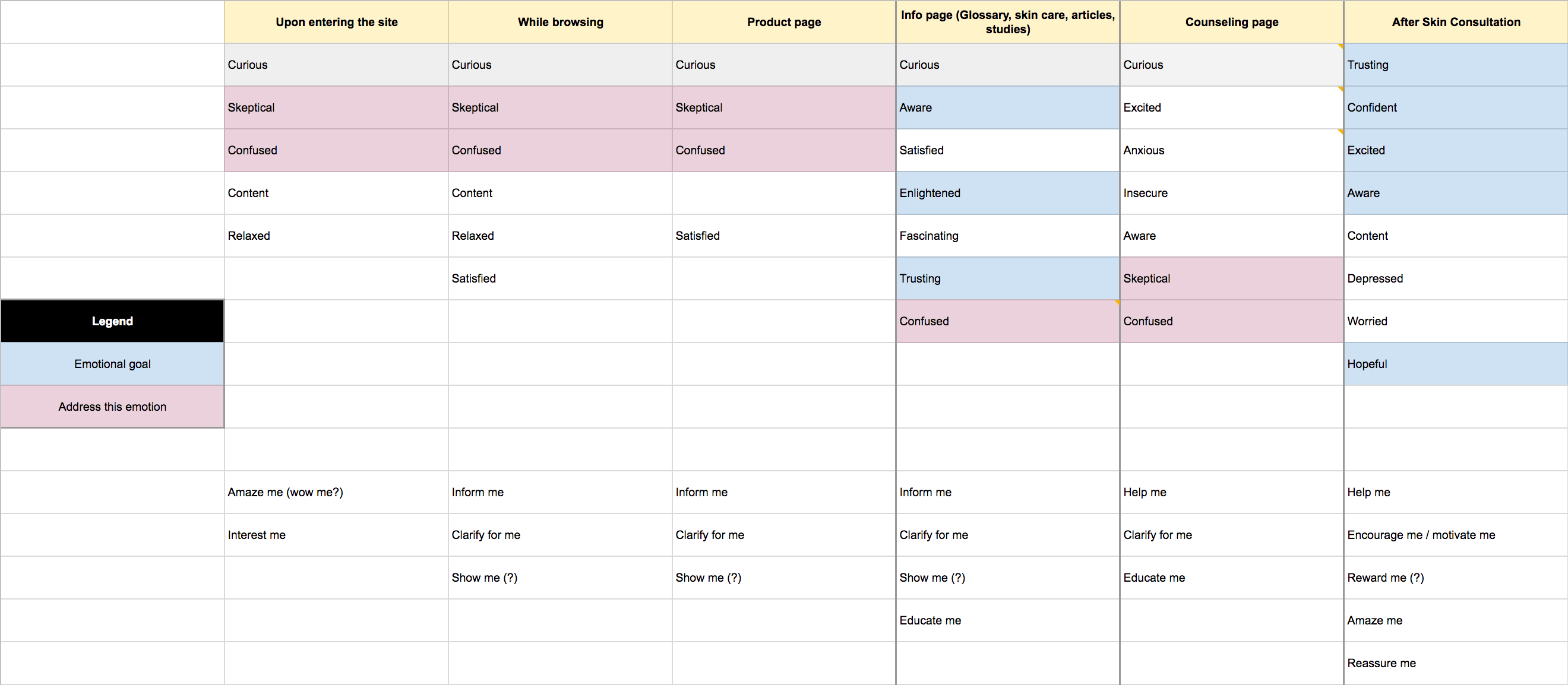
I wanted to dig into the emotions of people who had experienced the skincare consultation from the brand’s counters before and use that to guide the intent for each page. I looked at blogs to get some quotes and feedback about their experiences, collected those in a document, and mapped out their emotional journey in a table:
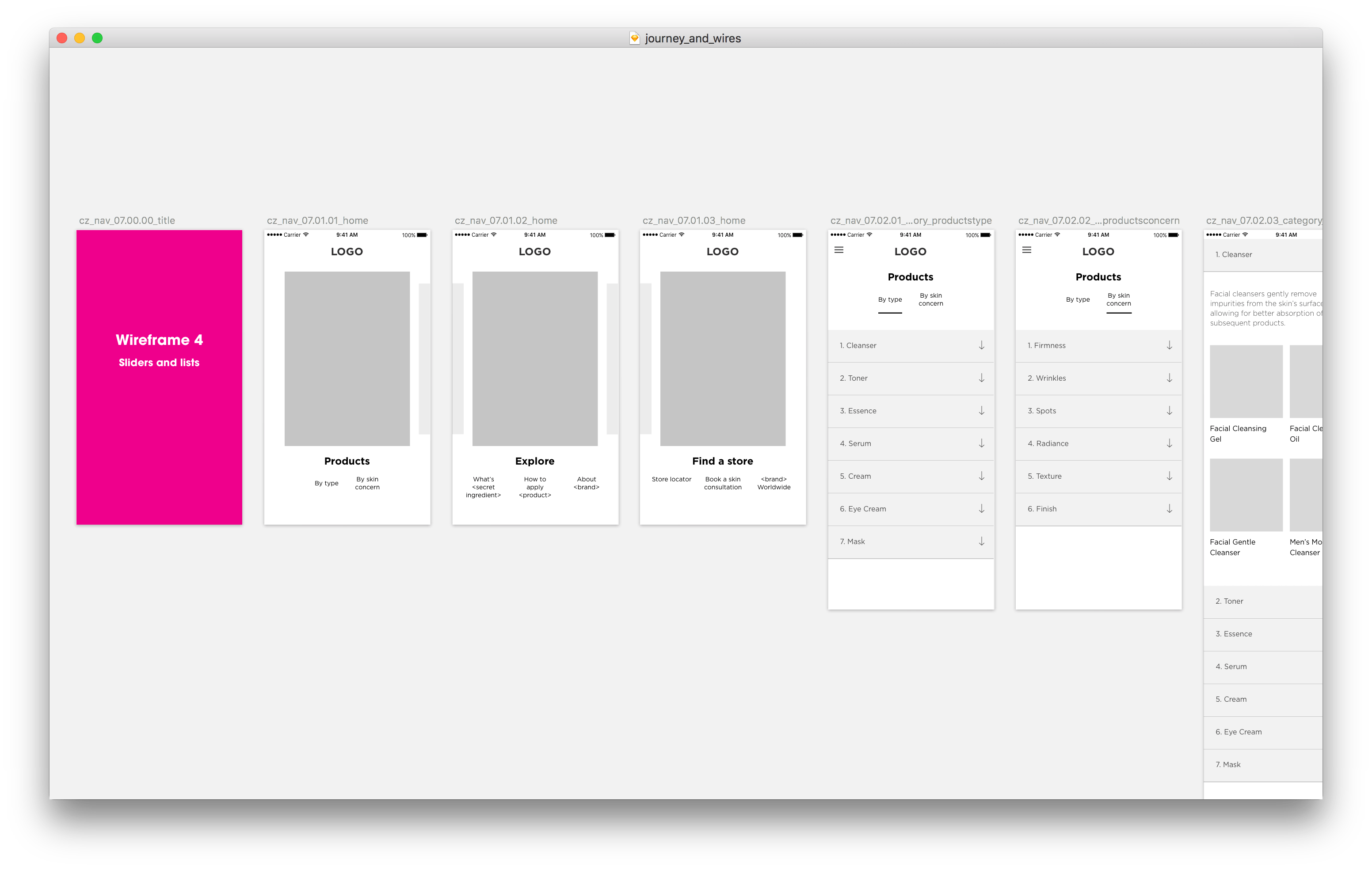
The team shared various ideas for the pages of the site but we were assigned to own specific pages. We first started with the overall sitemap, followed by the navigational structure for the site.
We were inspired by bottom navigation commonly found in apps and gesture-based interactions. It’s becoming more common to see web sites adapting UI usually seen on apps. People are now spending more time on apps compared to the web browser that their mental models have been shaped by various apps. The website would be accessed by customers in Japan who were more likely to view it on their phones rather than on desktop so we proposed ideas with a distinctive mobile experience.
The ideas were exported into Invision as clickable prototypes for quick proofs of concepts.
Gestures would revert to scroll interactions when viewed on the desktop so that navigating through pages would be comfortable and convenient contextually. Because Invision lacked the capability to develop gesture-based prototypes and animations, further iterations on the navigation patterns were made on Framer.
By working together with the UX team, we went through more iterations on the navigation framework. We discussed which ideas could scale and weighed in some reservations of the client when it came to patterns that they were unfamiliar with. We looked for a sweet spot that leveraged what people are used to while introducing swipes or bottom navigation elements to categories and product detail pages.
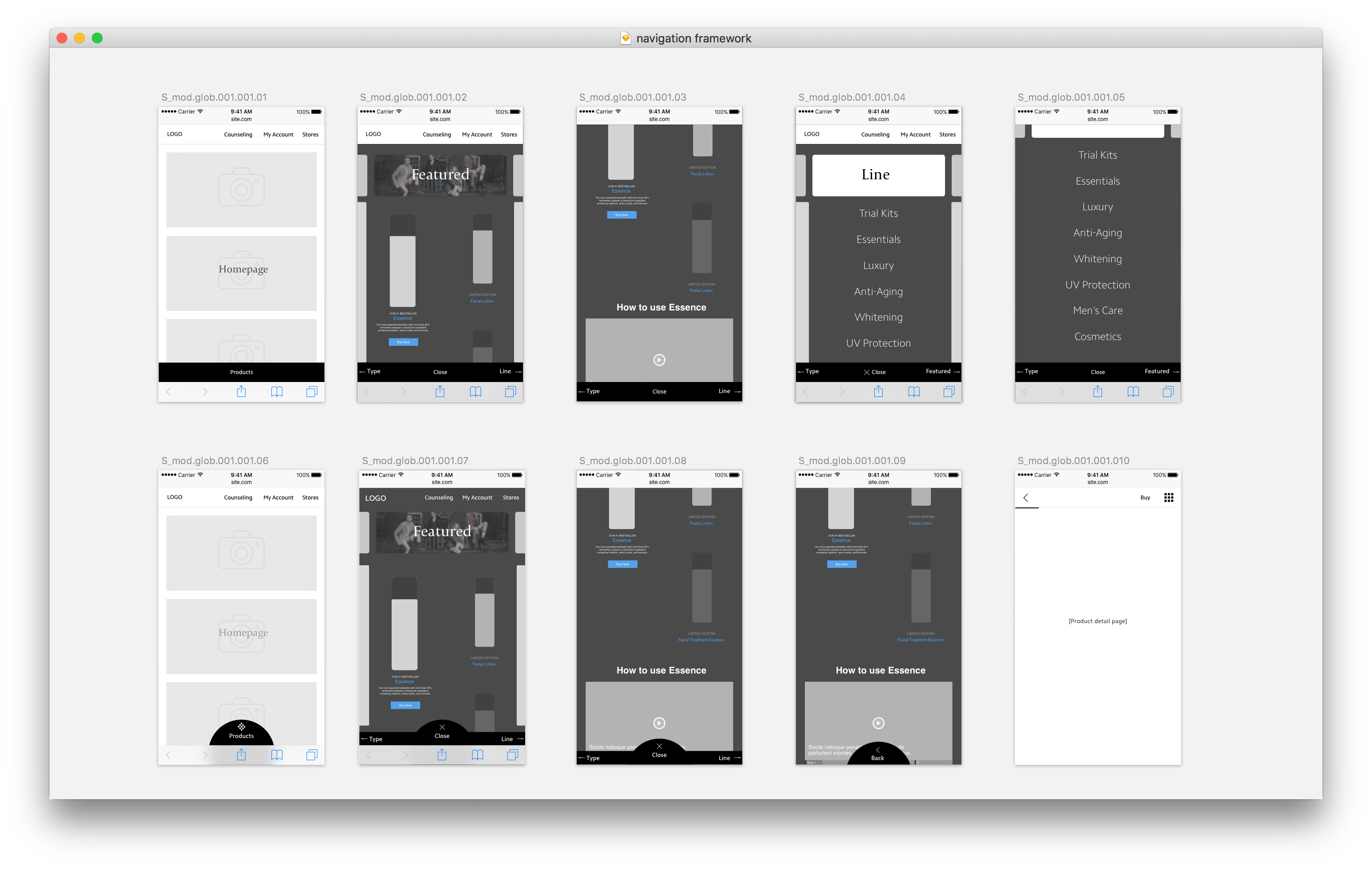
We prototyped early to communicate the concept and framework to the team and the client. Due to internal processes and stakeholders, the navigation implemented was replaced by a traditional hamburger menu.
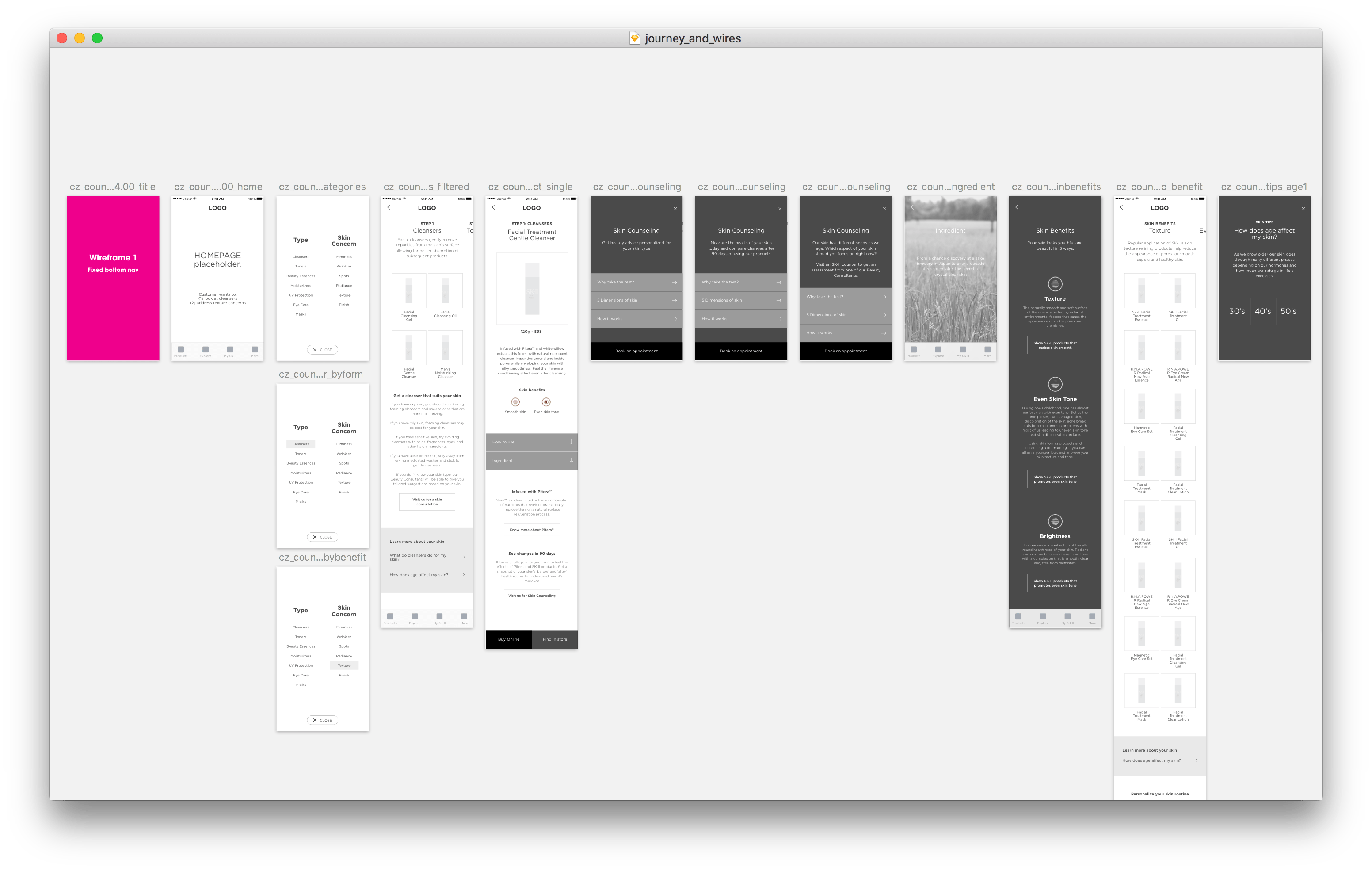
I created wireframes and prototypes; the visual design of the site was owned by the Visual Design team. We worked closely with the copywriting team for the content strategy of the site. As the project progressed, the wireframes used for the prototypes were slowly replaced by the visual designs. The team worked with an outside development company, and the prototypes helped communicate the interactions the design team wanted to execute.
Design: pages and user flows
The team split the different user flows among ourselves. One of the pages we had to propose was the user’s account. What could draw customers back into the brand site and use it as a service?
I used Aaron Otani’s four stages of behavioral design as a guide:
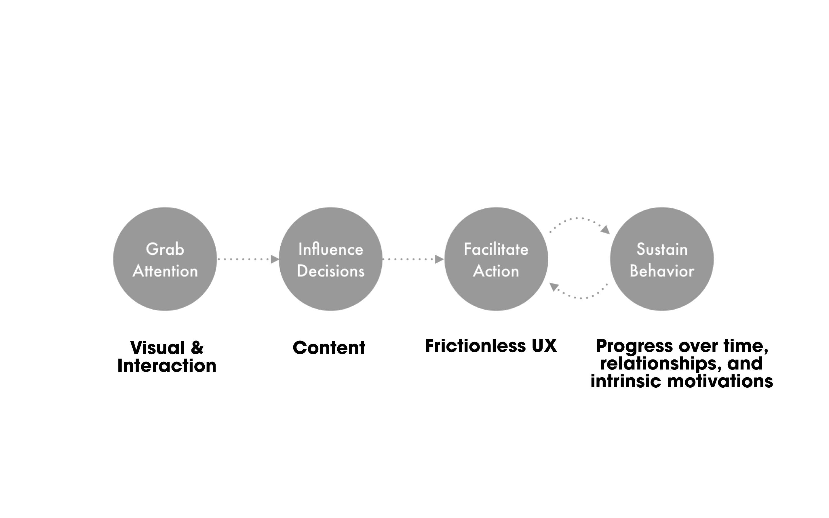
I went back to the customer’s goals to design a page that could motivate them to come back. Knowing this, we could design the messaging and information we show to the customer in ways that would help them reach their goal.
On a conceptual level, there were a lot of things the brand could build. We split the Account page into 3 phases: Now, Later, Future. This could help the client prioritize based on the features they currently have and the technologies they should be investing in right now, as well as the improvements they can execute in the future.
Clickable prototypes were created at the minimum to communicate user flows to the rest of the team. Module lists and documentation was also created to guide other teams. We discussed pages with other designers, the copywriters, and members of the team so we could quickly identify modules that were missed or business goals that were overlooked.
User Testing
The team conducted user testing sessions on the product detail pages to observe and understand how customers purchased skincare products. I assisted another UX designer by listening and taking down notes as he conducted the sessions. Together with the visual design team, we updated our designs through iteration based on the discoveries made during user testing. Some of the changes were visual and simple but the sessions also forced us to pull back on concepts that wouldn’t be built to its best potential due to deadlines and cost.
We synthesized our findings and brought the recommendations back to the Visual Design Team.
Evaluation
Overall, I was proud of a number of things:
- My contributions towards a collaborative workflow (introducing to the team a Sketch + Craft Library synced online). We had to work around constraints in our tools but overall it made sharing assets easier and sped up our workflow.
- Prototypes were created to communicate concepts and to test how well the navigation and interactions feel through actual touch and gestures.
- The website experience we proposed was in line with where I believe brand web experiences are headed: with a focus on the mobile experience, influenced by UI from apps.
I learned a lot about working on bigger teams and client-related roadblocks during the 5 months that we were working on this project. This track of work was only one of the many that the brand needs to implement to truly transform itself from a consumer goods company to a service company.
The redesign has been launched and is currently live on the Japanese and Singapore markets.